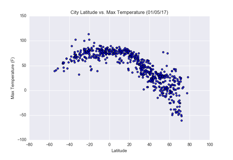
From looking at this plot, the distribution of data points should make sense based on one's knowledge of longitude and latitude From the moment that one is taught about longitude and latitude, one of the main rules of thumb is that the closer one city's latitudinal coordinate is to 0 degrees, then the closer it is to the equator.
The closer a place is to the equator, the hotter it is. This illustration is a perfect example of this concept. Despite the fact that there are some outliers (points that are isolated from the rest clustering of other points), one can observe that the apex of the curve (highest Max temperatures) occur at a latitude of 0 degrees.